Homework:
Repeat the same modular grid in three 3 pages (8.5"x11").
Arrange running text in different ways in each page. (dummy or real text should be 10pt size, whatever alignment you want)
***Bring STAPLED BW printouts showing the grid (you can make a screenshot COMMAND+SHIFT+4, then click and hold mouse button to select the entire artboard). Use the software guidelines as your grid lines, so, in the end you'll print the 3 screenshots of your artboards.
Thursday, March 24, 2011
Thursday, March 10, 2011
Brochure_More inspiration
Click on the links to see some cool designs!
http://www.touchey.com/design-update/10-creative-brochure-designs-vol2.html
http://www.behance.net/gallery/Anchure-brochure/311047
http://www.flickr.com/photos/gregcannon/4013828879/
http://www.flickr.com/photos/inkdphotos/3466811859/ (GREAT EXAMPLES)
http://www.behance.net/gallery/Fabriquem-Emocions/516289
http://www.behance.net/gallery/IamExpat/466304 (GREAT)
http://www.sortdesign.co.uk/stpatricks.html
http://www.behance.net/gallery/Move-Amsterdam/466366
.
What you must bring to class right after the break_3/22
Spring break will be a good time to gather all written information you'll need in your brochure. You can copy and paste it from the landmark's or tourist attraction's website and also create your own copy to complement it, if necessary.
Remember that you have to have at least 5 sections (About us, Annual events, Why contribute, etc). See post "Brochure_checklist" and assignment sheet)
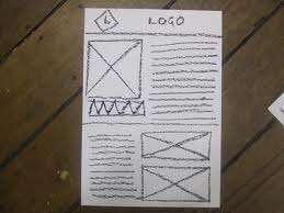
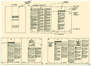
Also, after the break you'll need to bring a full size dummy/mock-up with your final layout "indications". In other words, you'll need to indicate with simple lines how text is going to look like in your brochure - number of columns, column width, height, where the 3 words are going to be located and how, etc. It must look like something like this:

 However, your layout must be indicated in a full size dummy of your brochure NOT sketched in a flat piece of paper. We must be able to hold your brochure in our hands and "experience" how it is going to be folded, how text is going to behave, etc.
.
Brochure_Checklist
Hey guys,
Before you continue, make sure you've covered the points below:
1. Your brochure has at least 750 words.
2. You're using one or two typefaces you've used in your postcard.
3. You have the remittance form (content of the form must be realistic - research existing forms to know what should go in your form)
4. You DO have ALL 3 words of your postcard and that you're using them as they are in the postcard or building upon those graphics.
5. Your brochure fits in a standard envelope.
_ Make sure you have a visual appealing cover for your brochure. It can be all type or a mix of type and image/images.
_ Remember to create an effective visual HIERARCHY with type. This is a crucial part of this project, because it will show that you do understand how to display type in your layout and how well you can work with it.
.
Wednesday, March 9, 2011
Type test on Apr 21th
What you should study for the test:
_ All readings assigned to date (see syllabus)
_ Type Anatomy PDF handout posted to Blackboard
_ Grid components PDF posted to Blackboard
_ Page Layout & Alignment PDF posted to Blackboard
The test will contain multiple choice questions and a section related to the anatomy of type, where you'll need to identify (write) certain characters' parts (eg. leg, dot, ear, counter, etc.)
.
Tuesday, March 8, 2011
Brochures/Mailers
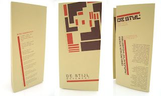
Look at these cool brochure/mailers**.


 More examples?
Click here 1.
Click here 2.
Click here 3.
Click here for Google results for "Cool brochures"
* Source
** Source
Subscribe to:
Comments (Atom)


